TWEEEEEEEET!!!
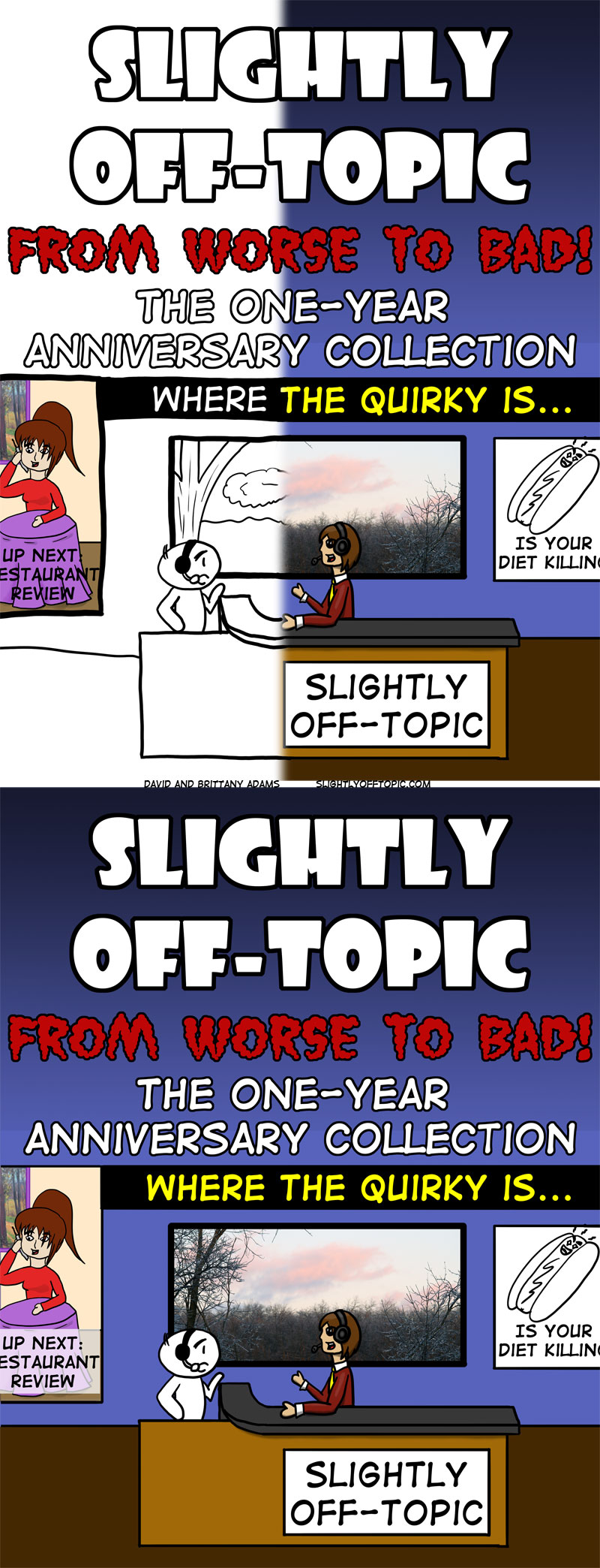
I’m calling a do-over. I’m basically dissatisfied with the art for today’s intended comic, so rather than put up something that I’m displeased with, I’ve decided to put up a couple book covers (some of you have seen one of them) and ask which style you prefer.
I originally created this cover as a t-shirt design as I had no intention of putting year one together in book form, but since previewing the design, I’ve received a surprising amount of emails asking if I could go ahead and make a book available. As it happens, one of the panels I’m working on for Penguicon is a guide to self-publishing, so yes. If you really want it, I can do that.
But for right now, which design do you prefer?
And be sure to check back Sunday for the do-over and a very special cameo…


Seeing as you asked – I prefer the second, full colour, one.
Greeting from Adelaide, South Australia!
That’s actually my favorite as well, but opinion seems to be swinging the other way. I had a student from Adelaide when I was teaching flow courses online. Thanks for stopping by.
I prefer the top one — I like the transition from B&W to Kodachrome.
That’s what I’ve been hearing. uhm… you might find your shirt a little disappointing then…
LOL
I like both, but for the book, the top one fits better, as it better illustrates (heh) the transition the comic has undergone.
(snooty voiceover) “And the splash of color in an otherwise dreary drawing evokes the pretense of life in the imagination, and draws attention to the belief that not everything is simply Black and White.”
The problem with the first one is that it has some color mixed in with the black and white (the painting and the font). It disrupts what you were going for. There’s also a bombardment of text, the less text on the cover, the better…
Good points all. I’ll see what I can do!